Reference number
ISO 9241-151:2008(E)
Draft
2008-05-15
Ergonomics of human-system interaction
Part 151:
Guidance on World Wide Web user interfaces
Ergonomie de l'interaction homme-systeme
Partie 151: Lignes directrices relatives aux interfaces utilisateurs Web
Contents
Foreword
Introduction
1 Scope
2 Normative references
3
Terms and definitions
4
Application
5 A reference model for human-centred design of World Wide Web user interfaces
6 High-level design decisions and design strategy
7 Content design
8 Navigation and search
9 Content presentation
10 General design aspects
Annex A
(informative)
Overview of the ISO 9241 series
Annex B (informative) Sample procedure for assessing applicability and conformance
Bibliography
Foreword
ISO (the International Organization for Standardization) is a worldwide federation of national
standards bodies
(ISO member bodies). The work of preparing International Standards is normally carried out through ISO
technical committees. Each member body interested in a subject for which a technical committee has been
established has the right to be represented on that committee. International organizations,
governmental and
non-governmental, in liaison with ISO, also take part in the work. ISO collaborates closely with the
International Electrotechnical Commission (IEC) on all matters of electrotechnical standardization.
International Standards are drafted in accordance with the rules given in the ISO/IEC Directives, Part
2.
The main task of technical committees is to prepare International Standards. Draft International
Standards
adopted by the technical committees are circulated to the member bodies for voting. Publication as an
International Standard requires approval by at least 75 % of the member bodies casting a vote.
Attention is drawn to the possibility that some of the elements of this document may be the subject of
patent
rights. ISO shall not be held responsible for identifying any or all such patent rights.
ISO 9241-151 was prepared by Technical Committee ISO/TC 159, Ergonomics, Subcommittee SC 4,
Ergonomics of human-system interaction
.
ISO 9241 consists of the following parts, under the general title Ergonomic requirements for office work with
visual display terminals
(VDTs):
- Part 1: General introduction
- Part 2: Guidance on task requirements
- Part 3: Visual display requirements
- Part 4: Keyboard requirements
- Part 5: Workstation layout and postural requirements
- Part 6: Guidance on the work environment
- Part 7: Requirements for display with reflections
- Part 8: Requirements for displayed colours
- Part 9: Requirements for non-keyboard input devices
- Part 11: Guidance on usability
- Part 12: Presentation of information
- Part 13: User guidance
- Part 14: Menu dialogues
- Part 15: Command dialogues
- Part 16: Direct manipulation dialogues
- Part 17: Form filling dialogues
Guidance on software individualization is to form the subject of a future part 129.
ISO 9241 also consists of the following parts, under the general title Ergonomics of human-system interaction:
- Part 20: Accessibility guidelines for information/communication technology (ICT) equipment and services
- Part 110: Dialogue principles
- Part 151: Guidance on World Wide Web user interfaces
- Part 171: Guidance on software accessibility
- Part 300: Introduction to electronic visual display requirements
- Part 302: Terminology for electronic visual displays
- Part 303: Requirements for electronic visual displays
- Part 304: User performance test methods
- Part 305: Optical laboratory test methods for electronic visual displays
- Part 306: Field assessment methods for electronic visual displays
- Part 307: Analysis and compliance test methods for electronic visual displays
- Part 308: Surface-conduction electron-emitter displays (SED) [Technical Report]
- Part 309: Organic light-emitting diode (OLED) displays [Technical Report]
- Part 400: Principles and requirements for physical input devices
- Part 410: Design criteria for physical input devices
- Part 920: Guidance on tactile and haptic interactions
Framework for tactile and haptic interaction is to form the subject of a future part 910.
Introduction
It is widely accepted that usability is a key factor in successful website design but until now there
has been no
internationally agreed standard that specifically addressed the usability of World Wide Web (WWW or
Web)
user interfaces.
World Wide Web user interfaces pose particular usability problems:
- their users are diverse in knowledge, capabilities, language and other factors - for example, a World
-
Wide Web user interface that works well for subject-matter experts may be sub-optimal for ordinary users;
- users' goals vary considerably - for example, a site optimized for one set of tasks (such as e-commerce transactions) could be sub-optimal for users whose tasks are different (such as information gathering);
- different Web browsers or user agents often render Web content in different ways - for example, the layout of individual pages can change, sometimes quite dramatically.
Users of the World Wide Web will have experienced the problems of inconsistency between websites and
often even within the same website. For example, something as straightforward as a link may be denoted
by
underlining on one page, by a mouse-over on a second page and by nothing at all on a third page.
A number of guidelines for good practice exist, many on the Web itself, but these guidelines sometimes
conflict and can also be difficult to put into practice. While not addressing Web user interfaces
specifically, a
number of International Standards are available that provide useful guidance on usability and the
design of
user interfaces: ISO 9241-11 to ISO 9241-17 and ISO 9241-110 provide ergonomic guidance on the design
of
software user interfaces in general, ISO 13407 on achieving usability by incorporating user-centred
design
activities throughout the life cycle of interactive computer-based systems, and the ISO 14915 series of
standards on the design of multimedia and hypermedia aspects of user interfaces.
The recommendations and guidelines provided in this part of ISO 9241 apply primarily to the design of
the
content of a website or, more generally, a Web application, the user's navigation and interaction, as
well as
the presentation of the content. The user interface of different types of user agents (such as Web
browsers) or
additional tools such as Web authoring tools are not the subject of this part of ISO 9241, although
some
guidelines could apply to those systems as well. Aspects of the technical implementation of the
recommendations are also not within its scope.
An important objective for developing Web user interfaces is to make them accessible to the widest
possible
range of users, including persons with disabilities. While some guidance provided in this part of ISO
9241 is
also important for the accessibility of Web user interfaces, it does not aim at covering accessibility
in a
comprehensive manner. Common guidance on securing and improving accessibility to ICT (information and
communication technology) equipment, software and services can be found in ISO 9241-20, and detailed
guidance on the accessibility of software user interfaces in general can be found in ISO 9241-171,
while the
World Wide Web Consortium's Web Accessibility Initiative provides guidance specifically for Web
content,
user agents and authoring tools.
ISO 9241 was originally developed as a seventeen-part International Standard on the ergonomics
requirements for office work with visual display terminals. As part of the standards review process, a
major
restructuring of ISO 9241 was agreed to broaden its scope, to incorporate other relevant standards and
to
make it more usable. The general title of the revised ISO 9241, "Ergonomics of human-system
interaction",
reflects these changes and aligns the standard with the overall title and scope of Technical Committee
ISO/TC 159, SC 4. The revised multipart standard is structured as series of standards numbered in the
"hundreds": the 100 series deals with software interfaces, the 200 series with human centred design,
the
300 series with visual displays, the 400 series with physical input devices, and so on.
See Annex A for an overview of the entire ISO 9241 series.
INTERNATIONAL STANDARD
ISO 9241-151:2008(E)
Ergonomics of human-system interaction -
Part 151:
Guidance on World Wide Web user interfaces
1 Scope
This part of ISO 9241 provides guidance on the human-centred design of software Web user interfaces
with
the aim of increasing usability. Web user interfaces address either all Internet users or closed user
groups
such as the members of an organization, customers and/or suppliers of a company or other specific
communities of users.
The recommendations given in this part of ISO 9241 focus on the following aspects of the design of
Web user interfaces:
- high-level design decisions and design strategy;
- content design;
- navigation and search;
- content presentation.
The user interfaces of different types of user agents such as Web browsers or additional tools such as
Web
authoring tools are not directly addressed in this part of ISO 9241 (although some of its guidance
could apply
to these systems as well).
Web user interfaces are presented on a personal computer system, mobile system or some other type of
network-connected device. While the recommendations given in this part of ISO 9241 apply to a wide
range of
available front-end technologies, the design of mobile Web interfaces or smart devices could require
additional guidance not within its scope; neither does it provide detailed guidance on technical
implementation
nor on issues of aesthetic or artistic design.
2 Normative references
The following referenced documents are indispensable for the application of this document. For dated
references, only the edition cited applies. For undated references, the latest edition of the
referenced
document (including any amendments) applies.
ISO 9241-11, Ergonomic requirements for office work with visual display terminals (VDTs) - Part 11:
Guidance on usability
ISO 9241-12:1998, Ergonomic requirements for office work with visual display terminals (VDTs) - Part 12:
Presentation of information
ISO 9241-13, Ergonomic requirements for office work with visual display terminals (VDTs) - Part 13: User
guidance
ISO 9241-14, Ergonomic requirements for office work with visual display terminals (VDTs) - Part 14: Menu
dialogues
ISO 9241-15, Ergonomic requirements for office work with visual display terminals (VDTs) - Part 15:
Command dialogues
ISO 9241-16, Ergonomic requirements for office work with visual display terminals (VDTs) - Part 16: Direct
manipulation dialogues
ISO 9241-17, Ergonomic requirements for office work with visual display terminals (VDTs) - Part 17: Form
filling dialogues
ISO 9241-20, Ergonomics of human-system interaction - Part 20: Accessibility guidelines for
information/communication technology (ICT) equipment and services
ISO 9241-110, Ergonomics of human-system interaction - Part 110: Dialogue principles
ISO 9241-171, Ergonomics of human-system interaction - Part 171: Guidance on software accessibility
ISO 9241-303, Ergonomics of human-system interaction - Part 303: Requirements for electronic visual
displays
ISO 13407, Human-centred design processes for interactive systems
ISO 14915 (all parts), Software ergonomics for multimedia user interfaces
WCAG 1.0, Web Content Accessibility Guidelines 1.0, W3C Recommendation, World Wide Web
Consortium
(W3C) (MIT, INRIA, Keio)
WCAG 2.0, Web Content Accessibility Guidelines 2.0, World Wide Web Consortium (W3C) (MIT, ERCIM,
Keio)
1)
3 Terms and definitions
For the purposes of this document, the following terms and definitions apply.
3.1
boolean search
search formulation using logical operators
3.2
browser
user agent allowing a person to retrieve and read hypertext, to view the contents of hypertext nodes
(usually
Web pages), to navigate from one node to another, and to interact with the content
NOTE
A browser also offers a set of operations, e.g. for navigating websites or for changing the visual
appearance of
the content displayed.
3.3
conceptual content model
abstract model describing the concepts of an application domain, the relationships among those concepts
and
the operations to be performed on the concepts or relationships
1) Working draft. Intended to supersede WCAG 1.0 in its final published version.
3
3.4
content
web content
?Web user interface? set of content objects
3.5
content object
interactive or non-interactive object containing information represented by text, image, video, sound
or other
types of media
3.6
dynamic navigation link
computed link
link that is computed dynamically by the system based, for example, on the content of a database
3.7
frame
mechanism for dividing a browser window into independent windows, each displaying a different document,
or
different parts of the same document
3.8
frameset
collection of frames and a corresponding layout structure that is presented in the same browser window
3.9
global navigation
set of navigation links available on all pages of a website
3.10
home page
start page
top page
main page through which users typically enter a website and whose URL is typically published or linked
as the
main Web address of an organization or an individual
NOTE
The term home page can be used differently in different contexts. Some groups will call a
complete website a
home page.
3.11
interaction object
component of the Web user interface accepting user input
EXAMPLE
Links, buttons, input fields, check boxes or selection lists.
3.12
Internet
worldwide interlinked computer systems and computer networks connected via gateways that enable the
transfer of data between them
3.13
intranet
computer network using Internet standards, the access to which is limited to members of a particular
organization such as a company
3.14
landmark page
landmark
main page in the navigation structure that can be directly accessed from many other pages
3.15
link
hyperlink
?World Wide Web? reference from some part of one document to (some part of) another document or another
part of the same document
NOTE
Links are also called hyperlinks because hypertext and hypermedia systems make extensive use of this
concept. Links are used for activating navigation. They are represented, for instance, as element tags
in the hypertext
markup language (HTML). The concept of links is also described in ISO 14915-2 in the context of
multimedia user
interfaces.
3.16
link cue
textual or graphical presentation of a link showing information about the link target
3.17
media object
component of a Web document that is implemented by a single media type
EXAMPLE 1
A text object presenting a discussion about some topic.
EXAMPLE 2
An image object presenting a picture of some person.
EXAMPLE 3
A sound object presenting a song.
NOTE
Adapted from ISO 14915-2:2003, definition 3.3.
3.18
navigation component
group of navigation elements placed together
3.19
profile
user profile
set of attributes used by the system that are unique to a specific user/user group
3.20
predefined user profile
profile based on a stereotype or combination of stereotypes
NOTE 1
Stereotypes used as the basis of a predefined user profile could include a role, a job function or a
group
membership.
NOTE 2
Predefined user profiles are often used to define access privileges to specific Web content.
3.21
rendering
act whereby the information in a document is presented
NOTE
This presentation is done in the form most appropriate to the environment (e.g. aurally, visually, in
print).
3.22
navigation
Web navigation
?World Wide Web? movement between or within Web pages or the movement within some presentation
segment presented on a page (e.g. the movement within a particular media object) that users perform to
find a
specific function or piece of information
NOTE 1
In this part of ISO 9241, navigation is used as a convenient short form for Web navigation (see also
ISO 14915-2).
NOTE 2
Navigation steps are often initiated by activating some link.
5
3.23
navigation structure
Web navigation structure
?World Wide Web? structure composed of elementary or composite presentation segments (such as Web
pages or media objects contained in a page) and links, determining all possible paths on which users
can
move around in a Web user interface
3.24
screen reader
assistive technology that allows users to operate software without needing to view the visual display
NOTE 1
Output of screen readers is typically text-to-speech or Braille.
NOTE 2
Screen readers rely on the availability of information from the operating system and applications.
3.25
site map
textual or graphical overview of the complete navigation structure of a website
3.26
splash screen
temporary page shown prior to the homepage when a website is first accessed
3.27
tool tip
small pop-up window that appears when the mouse pointer is moved over an interaction object and that
shows explanatory text or help information
3.28
transaction
action that involves inserting, updating or deleting information
3.29
Web user agent
user agent
front-end software that enables users to interact with a remote system through Internet protocols
NOTE
A browser is a specific type of user agent.
3.30
uniform resource locator
URL
mechanism for identifying resources on the Internet (such as Web pages) by specifying the address of
the
resource and the access protocol used
NOTE
The official technical term as specified by the IETF is uniform resource identifier (URI), of
which URL is a
subset.
3.31
Web page
coherent presentation of a content object or set of content objects and associated interaction objects
through
a user agent
3.32
Web service
Web resource providing content and/or functionality that can be accessed remotely through standardized
protocols and software interfaces
3.33
website
site
coherent collection of interlinked Web resources (for example, Web pages or Web services) that is
located on
one or several computers connected to the Internet, and that can usually be accessed through the same
domain specification part of a URL
3.34
Web application
World Wide Web application
application providing functionality to the user through a browser or other type of user agent using Web
formats
and protocols
NOTE
Web applications in the sense of this part of ISO 9241 comprise websites that only deliver content,
that
combine content delivery with application-specific functionality or that provide only specific
application functionality such as
a particular Web service.
3.35
Web user interface
World Wide Web user interface
all aspects of a website or Web application related to content, functionality, navigation, interaction
and
presentation that are relevant for using a website or Web application
3.36
within-page link
link leading to a target on the same page
4 Application
4.1 Intended user groups
The following groups are intended users of this part of ISO 9241:
? developers and designers of Web user interfaces who will apply it during the development process;
? content providers who generate and maintain the content of a website or application;
? developers of content authoring tools who will integrate the mentioned recommendations into their
authoring tools;
? usability evaluators who will check that Web user interfaces meet its recommendations;
? buyers who wish to ensure the ergonomic quality of a software product or development.
4.2 Applying the recommendations
Each individual recommendation in this part of ISO 9241should be evaluated for its applicability and,
if judged
to be applicable, should be implemented, unless there is evidence that to do so would cause deviation
from
the design objectives or would result in an overall degradation in usability. In some cases, the
designer may
need to trade off one principle or recommendation in favour of another to achieve an optimal design.
4.3 Conformance
If a claim of product or application conformity with this part of ISO 9241 is made, the procedure used
in
establishing requirements for developing and/or evaluating World Wide Web user interfaces shall be
specified.
The level of specification of the procedure is a matter of negotiation between the involved parties.
Annex B
provides a basis both for determining and recording the applicability of all the recommendations and a
means
for reporting that they have been followed. Other, equivalent, forms of reporting are acceptable.
5 A reference model for human-centred design of World Wide Web user interfaces
The usability of a World Wide Web user interface is dependent upon many different but strongly related
factors. Giving structure to the complexity of Web user interface development, the reference model
shown in
Figure 1 distinguishes between design, process and evaluation aspects. Addressing these three aspects
in an
integrated manner is necessary to achieve human-centred Web user interface design. Since process and
evaluation aspects are covered in other International Standards, this part of ISO 9241 focuses on the
design
aspects, with design guidance and recommendations.
Figure 1 - Reference model
In the reference model shown in Figure 1, Web user interface design is structured in five major areas
or levels,
which have been used to structure this part of ISO 9241:
? high-level design aspects;
? conceptual content model;
? content objects and functionality;
? navigation and search;
? content presentation.
These areas can be seen as representing different levels in the overall design. While the levels do not
imply a
particular sequence or process, higher-level issues should usually be addressed before lower-level
design
decisions are made.
In addition, the following International Standards shall be consulted:
? for guidance related to software user interfaces, ISO 9241-110, ISO 9241-11, ISO 9241-12, ISO
9241-13,
ISO 9241-14, ISO 9241-15, ISO 9241-16 and ISO 9241-17;
? for guidance related to multimedia user interfaces, ISO 14915.
The other two parts of the model representing the process domain and the evaluation domain constitute
important additional aspects for the user-centred development of Web user interfaces. They are,
however, not
elaborated in this part of ISO 9241.
The process domain represents the procedural aspects of developing Web user interfaces. The design of
Web user interfaces - as for the design of interactive software systems in general - should follow a
human-centred design process, including an appropriate analysis of the intended user groups and their
tasks
or goals. ISO 13407 shall be consulted for guidance on human-centred design processes.
The evaluation domain refers to methods and criteria for assessing the usability of Web user
interfaces. In
addition to perceptual and cognitive factors, emotional and belief-related issues such as the
attractiveness or
trustworthiness of a website can be important when evaluating a Web user interface. Similarly, it can
be
important to assess the organizational and social effects of an application. Specific evaluation
criteria and
procedures will have to be specified for each of these different aspects, but are outside the scope of
this part
of ISO 9241.
6 High-level design decisions and design strategy
6.1 General aspects
Websites take on an increasing variety of forms, ranging from conventional websites as collections of
interlinked Web pages to specialized Web services, possibly accessed through specific devices. Content
provision is frequently integrated with application functionality that is potentially delivered by a
variety of
remote resources. These developments often blur the distinction between websites and conventional
applications, leading to the more general notion of Web applications. Web applications serve a wide
spectrum
of purposes, such as, for example, public information websites, e-commerce applications, intranet
applications,
location-adaptive services and many others. A clear definition of the purpose and strategic goal of the
Web
application to be developed is therefore a critical high-level design decision that influences many
other design
aspects.
Web applications and their context of use often have specific characteristics, which differentiate them
from
conventional software applications. While conventional applications, for example, are frequently
developed for
specific user groups, tasks or organizational contexts, public websites address a wide range of users
with
different interests, information needs and tasks. Also, users are no longer bound to one specific
system, but
may freely move to other websites with similar offerings.
In the process of designing a website, there are typically a large number of different stakeholders who
eventually will have to agree upon the purpose and design of the website. For this reason, issues such
as
defining the target audience, selecting appropriate business models or the definition of a suitable
genre and
design style for the site need to be explicitly stated and discussed among the stakeholders. When
analysing
and defining the target user groups, it is critical to consider the diversity of the users expected and
the range
of capabilities and disabilities they may have. An important design goal is to make Web user interfaces
accessible for the widest possible range of users, particularly taking into account potential user
limitations in
perceiving, operating or understanding the Web user interface.
Depending on the purpose of a Web application, different design goals may be prioritized. For instance,
design goals such as "fun" or credibility may have different relevance for a banking website compared
with an
entertainment website. Prioritizing these goals with respect to the prospective users and their needs
constitutes an important aspect of designing a Web user interface.
6.2 Determining the purpose of a Web application
The purpose for which a Web application is developed should be explicitly defined in order to provide a
clear
basis for developing appropriate content and functionality and for determining further design
objectives.
NOTE
Defining the purpose can involve, for example, developing the company image, promoting products or
supporting e-business. The purpose of a website could be narrowly defined as, for example, in an online
ticket-sales
system, or more open-ended, a web site providing a platform for a community of users. Websites are
often developed to
serve a number of different purposes at the same time. In such cases, aspects such as the ability of
users to easily obtain
an overview of the scope of the content and functionality provided are important.
6.3 Analysing the target user groups
In the process of defining the purpose of a Web application, the target user groups should be
identified.
NOTE
General guidance on considering users and their tasks can be found in ISO 9241-2 and ISO 9241-11.
6.4 Analysing the users' goals and tasks
The goals and tasks of the intended users should be analysed.
6.5 Matching application purpose and user goals
The purpose of the Web application (determined according to 6.2) should be compared and, if necessary,
matched with the users' goals and tasks to ensure that users can accomplish their goals.
Frequently, there are conflicts between the goals of the provider of a website and user goals, for
example, if
advertizing is one of the purposes of a website at the same time as users desire to use an information
service
efficiently. In such cases, it is important to design the system so that the user is not negatively
affected by the
goals of the provider.
6.6 Recognizing the purpose of a Web application
The intended purpose(s) of a Web application should be easily recognized by the user.
EXAMPLE 1
An online shopping website is recognizable by the title, description and graphical visual design of the
home page.
EXAMPLE 2
A short descriptive sentence (tagline) is used on an e-commerce website to convey what a company
does and how it differs from its competitors.
If a website has more than one purpose, it is important that the site's content and navigation support
users to
discriminate among the purposes.
Web applications have over time evolved into different types, e.g. online news channels, electronic
shops or
educational websites. These application types or genres often use specific, recurring forms and
structures for
delivering content that may be tailored to different user groups. Employing these design patterns can
be
valuable for making the purpose of a Web application easily identifiable and for providing consistent
Web user
interfaces. However, it should also be noted that the boundaries between different genres are not well
defined,
that they may overlap and that new genres can rapidly evolve due to the flexibility of the online
medium.
6.7 Prioritizing different design goals
If there are different competing design goals they should be prioritized with respect to the most
likely frequent
and/or critical tasks and needs of the users.
Different design goals, such as, "present detailed information", "design attractive pages" and "keep
users
engaged" can conflict with one another. If that is the case, it is important that these design goals be
prioritized
with respect to the user's most frequent or critical tasks and to find suitable trade-offs.
6.8 ICT accessibility
ISO 9241-20 shall be consulted for guidance on ICT accessibility. Web user interfaces should meet its
requirements and recommendations.
6.9 Software accessibility
ISO 9241-171 shall be consulted for guidance on software accessibility. Web user interfaces should meet
its
requirements and recommendations.
6.10 Web content accessibility
WCAG 1.0 and, superseding this, WCAG 2.0 when published in its final version, shall be consulted for
guidance on web content accessibility.
6.11 Identifying the website and its owner
The identity of a website and the website owner should be presented clearly and accurately and should
be
displayed on all relevant pages. If the site owner is a business entity, appropriate information about
the
company or organization should be provided.
EXAMPLE
A corporate logo is available on all pages as a link to the home page where further information on the
website owner is presented.
NOTE 1
Identifying the website can include elements to both define and contact that organization, including
business
name and contact channels that are open (address, e-mail, fax, phone, messenger, etc.).
NOTE 2
Adding suitable metadata is an additional means for making a website identifiable.
6.12 Coherent multi-site strategy
If the information or services provided by an organization or different parts of that organization are
distributed
over different websites or subsites, a coherent strategy should be developed and implemented that
allows
users to navigate consistently between the different sites and to locate relevant information or
services without
prior knowledge of the purpose, interrelationship and content of the different sites.
NOTE
A style guide might be of assistance to the user interface designer or developer in multi-site
situations in
implementing a coherent strategy.
7 Content design
7.1 Conceptual content model
7.1.1 General
A conceptual model of the Web user interface describing the concepts and relations of the application
domain
is an important basis for defining the content and the navigation structure. Such a conceptual model
can be
developed by analysing the tasks and mental models of the prospective users, as well as existing
information
structures such as subject hierarchies (taxonomies). Also, different user roles (e.g. consumer vs.
business
customer) or expectations resulting from using other systems can influence the design of an appropriate
conceptual model.
7.1.2 Designing the conceptual model
The conceptual model should be based on the tasks and mental models of the expected users or user
groups,
using suitable task analysis techniques and taking into account the communication goals of other
stakeholders
such as the information or service provider.
EXAMPLE
In the conceptual model of an online shop, red wines from Bordeaux are a subcategory of red wines,
which are a subcategory of wine and so on. Due to the high popularity of Bordeaux wines, the category
is shown at the top
level in the navigation structure to attract customers' attention.
A conceptual model can be developed by a variety of methods such as card sorting or drawing affinity
diagrams and can be expressed, for example, in an information model using appropriate modelling
techniques,
e.g. unified modelling language (UML) or topic maps.
Conceptual models can be conveyed through appropriate metaphors, for example, when using a newspaper
layout to indicate the importance of different articles.
7.1.3 Appropriateness of content for the target group and tasks
The content provided should be suitable for the purpose of the Web application, the target audience
(characterized by different goals, previous knowledge, preferences, etc.) and their tasks (see also
ISO 9241-11).
EXAMPLE
The Internet presentation of a company provides an overview of the company's competencies and
products relevant for prospective customers. The intranet of that company, however, focuses on the
description and
support on internal processes and on the exchange of knowledge among the employees.
In order to provide appropriate content, a number of analysis and design techniques can be employed,
such
as writing scenarios of the intended use, collecting and organizing topics in participative design
sessions
involving prospective users, or developing information models with different degrees of formality (such
as
thematic networks or class models).
7.1.4 Completeness of content
The content of a website should be sufficiently complete with respect to the purpose of the site and
the typical
information needs of the user.
Users expect a website to contain all or most of the content relevant for their particular task and
information
needs. For established types or genres of websites, such as the home pages of a computer supplier or
travel
agency, presenting the range of topics and the level of detail typically associated with the genre are
important
factors that contribute to the perceived completeness of the site.
Relevant content can also be provided by presenting links to other websites containing that content.
7.1.5 Structuring content appropriately
In order to achieve usable navigation structures, content should be structured based on the user's
tasks and
information needs as well as their mental model.
EXAMPLE
In an online newspaper, brief summaries of current news are presented at the top-level of the website
with links to the detailed articles. The decomposition of an article into summary and detail allows the
user to quickly select
those news items that are of particular interest, while obtaining an overview of all current news.
7.1.6 Level of granularity
Units of content should have an appropriate level of granularity (level of detail), especially if a
unit of content is
to be used in different parts of the website or reused for different purposes.
EXAMPLE
A news article is represented as a short headline, an abstract several lines long, or a multi-page
in-depth
description of an event.
7.2 Content objects and functionality
7.2.1 General
Based on the conceptual content model, concrete content objects are developed that can be represented
as
text, images, animations or other media types. Content objects can be non-interactive, only providing
information to the user, or interactive, allowing the user to provide input and use the functionality
of the Web
application.
7.2.2 Independence of content, structure and presentation
Content should be developed to enable easy adaptation of its presentation or structure to changing user
requirements in order to allow delivery in different contexts (e.g. internationalization, user mobility
or specific
devices). This can be facilitated by keeping the content, its structure and presentation independent of
each
other. Keeping content and functionality, structure of the content and presentation independent of each
other
helps to improve accessibility.
EXAMPLE 1
The content of a news site consisting of article abstracts, pictures and in-depth news stories can be
navigated and presented in many different forms, e.g. pictures can be embedded in the text or accessed
through links
shown with the abstract. Detailed text can be shown permanently or only on demand. Text styles are
different for displays
of different sizes.
EXAMPLE 2
Using HTML (hypertext markup language) tables to control the layout of a Web page can make it difficult
to navigate and understand the content of the page when viewed on a cell phone or presented with a
screen reader (by a
user with a visual impairment).
NOTE
A variety of techniques is available for achieving independence, including cascading style sheets
(CSS),
semantic mark-up such as XML (extensible markup language) - possibly in conjunction with XSL
(extensible stylesheet
language) or CSS - and functions provided by a content management system.
7.2.3 Selecting suitable media
7.2.3.1
Selecting appropriate media objects
Media objects should be selected based on the type of content to be presented, the user's tasks and the
communication goal to be achieved. Detailed guidance on selecting and combining media objects is to be
found in ISO 14915-3.
EXAMPLE
A video is used for illustrating a continuous action such as skiing to convey essential aspects of the
movement.
Applying this recommendation helps users understand the content, for example, when showing a continuous
action through a video. Web pages are often composed of different media objects, such as text, images,
video
or animation. Selecting appropriate media and combining them in a suitable manner is critical for the
user's
perception and understanding of the content.
NOTE 1
The use of dynamic media just for the purpose of attracting the user's attention to the website or page
could
overload the user's perception.
NOTE 2
When selecting appropriate media, it could be necessary to make trade-offs, for example, with respect
to
download time.
7.2.3.2
Providing text equivalents for non-text media objects
All non-text media objects, such as graphical images or video, should be provided with alternative
equivalent
textual descriptions and/or with equivalent text-based functionality.
Providing equivalent textual alternatives for non-text media objects facilitates use on devices with
small
screens. Furthermore, it facilitates text indexing and searching, as well as auditory presentation of
content. It
is also a critical component of accessibility.
7.2.3.3
Enabling users to control time-dependent media objects
When time-dependent media objects such as animations or moving text are presented, users should be
provided with functions to pause or stop the presentation of those media objects.
There are many time-dependent, dynamic media objects, including video, music, other auditory content,
animation blinking, scrolling and auto-updating of objects or pages. Users might want to control
time-dependent content for a variety of reasons: They might, for example, wish to avoid distraction
from their
task or view single static images of an animated presentation. Users with cognitive or visual
disabilities might
need to slow down or pause dynamic content. More detailed guidance on controlling dynamic multimedia is
given in ISO 14915-2.
NOTE
Not all time-dependent media objects can be stopped, particularly if the temporal aspect is inherent to
the task
or if the time-dependency relates to data processing that is being carried out.
7.2.4 Keeping content up to date
When the validity or relevance of content is time-dependent, no out-of-date content should be shown to
the
user, since users expect the content of a website to be up to date.
EXAMPLE
A weather forecast included on a website is updated at least daily.
It is often useful to provide quick access to information that has been recently featured on a site,
for example,
in the last two weeks or month, by providing a history.
7.2.5 Making date and time of last update available
The date and (if important for the user's task) time of the last update should be available for all Web
pages or
content objects.
This allows users to judge the relevance or applicability of the information for their respective
goals. Date and
time information can be displayed either permanently or on demand.
7.2.6 Enabling communication with website owner
A means of communicating with the website owner should be provided, for example, in order to request
further information or to resolve a problem.
EXAMPLE
E-mail, postal address and a phone number, as well as a contact person, are indicated on a company
website.
It is useful for users to be additionally informed when to expect a reply, and it is good practice to
make contact
information easy to locate from the homepage or a specific "contact us" page.
7.2.7 Accepting online user feedback
Users should be provided with an online feedback mechanism that they can use for sending comments,
questions or ratings related, for example, to the content or products offered.
Feedback can be communicated by a variety of techniques, including e-mail, feedback forms or other
suitable
techniques. It is useful if some indication is provided on how and when user feedback will be taken
into
account. It is also useful that users receive an automated reply stating that their message has been
received.
7.2.8 Privacy and business policies
7.2.8.1
Providing privacy policy statements
If a website requires personal information to be entered, an explicit and easy-to-understand privacy
policy
statement should be provided, one that is readily available from those parts of the site where
information is
entered or transactions are initiated.
The following types of information are usually included in the privacy policy statement:
a) the nature of the information gathered/tracked;
b) how the information will be used;
c) with whom the information is shared.
NOTE
A number of countries have specific legislation or regulations addressing provisions for collecting
user data.
This can involve, for example, displaying a specific statement concerning the collection and use of
customer data.
It is advisable to provide the policy statement in a standardized format (such as the W3C's P3P
document
format) that supports processing the policy statement by user agents.
7.2.8.2
Providing a business policy statement
If relevant in the context of the application, a business policy statement should be readily available
on the
website.
EXAMPLE
The website contains a business policy statement including, among other regulations, information on how
to return goods.
NOTE
Some countries have specific legislation or regulations concerning the availability of business policy
information on websites.
7.2.8.3
User control of personal information
If personal information is entered on a website, users should be provided with mechanisms for
specifying
whether and how personal information is used.
It is preferable to require users to actively agree ("opt in") that their personal information may be
used rather
than having an option to disagree ("opt out").
It is advisable to provide functions that allow users to view, change, give or revoke their consent at
any time.
NOTE
A number of countries have specific legislation or regulations regarding user ownership of personal
information.
7.2.8.4
Storing information on the user's machine
If the Web application stores data or executable programmes on the user's local machine (e.g. by using
cookies), the policy for using those data or programs should be made explicit.
It is important that this policy be able to be clearly discriminated from other policy material such as
the privacy
policy as specified in 7.2.8.1.
7.2.9 Individualization and user adaptation
7.2.9.1
General
Adapting the content and the navigation of a Web user interface to individual users or user groups can
be a
useful mechanism for providing information that is of interest to the users and for making access to
relevant
information more efficient (see also the dialogue principle suitability for individualization in
ISO 9241-110).
User adaptation can also be important for making a Web user interface more accessible. Different
approaches
can be used for achieving these goals, including the following:
? providing users with means for customizing the website themselves to their personal needs
(individualization), designing content and navigation differently for varying user groups or roles
(such as
private consumers vs. business customers), with either the users identifying their roles or by having
the
system select a role for the user based on some criteria;
? monitoring the user's behaviour and adapting to the user's goals that are inferred from the behaviour
observed;
? recommending information that is potentially more relevant or interesting to the specific user, based
on
the behaviour of all users or a user group.
7.2.9.2
Taking account of the users' tasks and information needs
When providing different access paths or navigation structures for different user groups, the tasks and
information needs of these user groups should be taken into consideration.
EXAMPLE
In a corporate intranet, users from the financial department find links to currency exchange rate
information directly on the home page, while developers are provided with links leading to technical
news on that page.
7.2.9.3
Making individualization and adaptation evident
It should be made evident to the user when individualization and/or adaptation are used.
7.2.9.4
Making user profiles evident
If predefined user profiles or user-specified profiles are used for individualizing or adapting
content, the profile
currently used should be made evident.
If profiles are used, it is important to provide users with information about this concept and its
implications.
7.2.9.5
Allowing users to see and change profiles
If user-specified profiles are used, users should be able to see, modify and delete that profile on
demand.
EXAMPLE
A website provides users with a profile page on which they can check a number of product types in which
they are interested. When a new product becomes available matching those preferences, it is displayed
on the homepage
once the user enters the site. The user can access the profile page at any time and change his or her
preferences or
delete this information completely.
7.2.9.6
Informing about automatically generated profiles
If user profiles are automatically generated to adapt the Web user interface to the user, it should be
made
evident what kind of information is used and how it affects using the Web user interface.
EXAMPLE
Based on a user's navigation actions a news website generates a user profile to recommend topics that
are likely to be of interest to this user. The user is informed that these recommendations are made
because of his previous
interest in the topics recommended.
NOTE
In some cases, profiles are dynamically constructed while the user is navigating a website.
7.2.9.7
Switching off automatic user adaptation
If a Web user interface is automatically adapted, based on, for example, user profiles or behaviour
monitoring,
it should be possible for the user to explicitly switch off the automatic adaptation or switch to
another user
profile provided they are authorised to do so.
NOTE
Automatic adaptation or individualization may be confusing for users, for instance, if they have to use
a
different navigation path to access information than the one used in a previous visit. It is therefore
important to design
automatic adaptation mechanisms with care, taking into account the user's mental model and other
relevant factors.
7.2.9.8
Providing access to complete content
If user-specific or profile-based navigation is used, users should be able to explore the complete
content of the
website, provided they are authorized to do so.
NOTE
Users may not be aware that some information is not visible to them or is not at the location where
they expect
it to be, as a consequence of an individualized system-adapted navigation structure.
8 Navigation and search
8.1 General
Navigation involves the set of activities a user performs in a Web user interface to move from the
currently
visible (or otherwise perceivable) output of the system to another. This change can result in jumping
to a
different position on the same Web page, in the displaying of a different page, in showing changed
content in
a navigation frame, or some other change of the information displayed. Designing navigation involves
finding
a suitable mapping from the structure of the content to the navigation structure. General guidance on
mapping
content onto presentation segments and on designing navigation structures is provided in ISO 14915-2.
In contrast to navigation, which often requires the user to move to the desired content through several
navigation steps, search functions offer direct access to the content, provided that content was
retrieved in the
search. Navigation and search are often used in combination.
NOTE
In some cases, navigation actions can also be triggered by the system if, for example, a start-up page
("splash
screen") is automatically closed after a certain time.
8.2 General guidance on navigation
8.2.1 Making navigation self-descriptive
Navigation should be designed to help users understand where they are, where they have been and where
they can go next.
General guidance on achieving self-descriptiveness is given in ISO 9241-110.
8.2.2 Showing users where they are
Each presentation segment (page or window) should provide the user with a clear and sufficient
indication of
where he or she is in the navigation structure and of the current segment position with respect to the
overall
structure.
EXAMPLE
The user has moved through three levels in a product catalogue. The current page has a heading that
clearly indicates the product category described on this page. In addition, a row of labels at the top
of the page shows the
current category as well as the levels above, which allows the user to see the current position in the
overall structure and
to quickly return to higher levels (this technique is often called a "breadcrumbs" history).
Providing sufficient navigational information on each page is also important in cases where users have
arrived
at that page via a search function. In such a case, users have no context for deriving the meaning and
position
of the page in the navigation structure and are dependent on the information provided on each page.
8.2.3 Supporting different navigation behaviours
Users can exhibit different navigation behaviours depending upon their goals. They might know what they
are
searching for or might simply follow links that appear to lead to useful or interesting information.
When
designing navigation structures, the different user goals and navigation strategies should be
considered by
analysing the different behaviours that users are likely to exhibit and by allocating priorities to
them.
Navigation behaviours include the following.
? In goal-driven navigation, users decide rationally about the link to follow next, remember their path
and
backtrack as soon as they realise that they are not approaching their target. This behaviour is
supported
by efficient navigation paths, task-related design of navigation links, history and backtracking
functions.
? In heuristic navigation, users avoid planning and memorization, and navigate based on the information
and links currently visible. Implications for the design are that pages need to be comprehensible as
individual units, that links need to clearly describe their target, and that important information
ought to be
placed in higher levels of the navigation structure.
? In the mental map strategy, users infer the navigational structure of a website and use this map for
accessing the content. To support the development of mental maps, well-organized navigation structures
and overview techniques, such as site maps, are helpful.
? Other strategies are, for instance, memorization of frequently used navigation paths or cost-benefit
considerations trading off navigation effort against the expected value of the content.
8.2.4 Offering alternative access paths
Alternative access paths for navigating to a specific unit of content should be offered to support
different
navigation strategies.
EXAMPLE
A page containing legal regulations to be followed when exporting a product to other countries can be
accessed either through a content-based category, "export regulations", or through a step-by-step
procedure used when
shipping a product.
8.2.5 Minimizing navigation effort
The number of navigation steps needed to reach a certain piece of content should be minimized as long
as
different mental models, navigation strategies and tasks of the user are taken into account.
NOTE
In some cases, less effort is expended by the user when he or she makes more highly confident choices
of
navigation links (i.e. because the choices are specific and match their expectations), rather than
fewer, less confident
choices (i.e. because the choices are vague or confusing).
8.3 Navigation structure
8.3.1 General
The navigation structure determines all potential paths on which users can move around in the Web user
interface. For a given content structure, different navigation structures can usually be designed.
NOTE
The term information architecture is used by some authors as a synonym for navigation structure.
8.3.2 Choosing suitable navigation structures
Navigation structures should be designed both on the basis of the structure of the conceptual content
model,
and on the basis of the tasks and navigation strategies of the user. Navigation structures are
typically
hierarchies, networks or sequences of presentation segments or combinations thereof. General guidance
on
designing navigation structures is provided in ISO 14915-2.
EXAMPLE 1
A website can be explored based on a hierarchical decomposition of the topic and subtopics the site
presents. In addition, some important or new pieces of information are presented at the top level of
the navigation
structure although they belong to topics positioned at lower levels of the conceptual hierarchy. In
this case, a specific
piece of information can be reached through the top level as well as through the specific topic the
information is
associated with.
EXAMPLE 2
An e-commerce site offers a menu based on product categories (e.g. shoes) as well as a menu based on
user activity (e.g. hiking).
8.3.3 Breadth versus depth of the navigation structure
If the navigation structure is complex, broad navigation structures offering a larger number of links
on one
page should be preferred over deep ones requiring a large number of navigation steps, provided that the
links
on one page are logically grouped, meaningfully labelled, and that their number does not exceed the
user's
perceptual capabilities.
Guidance on breadth vs. depth in menus is to be found in ISO 9241-14.
8.3.4 Organizing the navigation in a meaningful manner
The navigation structure should be organized on the basis of the concepts that are meaningful and
relevant
for the user. This includes content-based, task-based, frequency-based and other forms of organization,
as
described in ISO 14915-2.
EXAMPLE 1
An e-commerce site offers a content-based navigation that maps a product classification to a catalogue
that can be browsed using links clearly labelled with the product category names.
EXAMPLE 2
In a Web-based business application, a navigation menu is offered based on the different user tasks
such as "enter new order", "change customer data" or "cancel order".
EXAMPLE 3
In the intranet of an organization, relevant documents are linked with the single steps of a
procurement
procedure. Users can navigate to these documents from each single step in a task-based navigation.
Additional content-
based access may be available for the same documents.
EXAMPLE 4
In an online shop, users can navigate to frequently purchased items from a list shown on the homepage.
8.3.5 Offering task-based navigation
For well-defined user tasks such as purchasing a product, the navigation structure should offer clearly
identifiable links to the page related to that task and should guide the user through the sequence of
pages for
multi-step tasks.
Frequent tasks can be supported by offering "quick links" to those tasks on the homepage. Within a
task,
users can be guided from step to step with appropriate options, such as "Back/Next", which are separate
from
the browser back button. It is important to give users a clear indication of their current position
within the task
as well as appropriate data processing feedback, for example, whether information which has been
entered in
a form is saved and/or processed when moving backwards.
8.3.6 Offering clear navigation within multi-step tasks
If users navigate between different pages (or presentation segments) belonging to the same multi-step
task,
they should be supported by appropriate techniques. Appropriate techniques comprise, in particular:
? providing step-by-step instructions;
? providing clear indications of the user's position in the task at all times;
? allowing users to move to previous steps and correct their entries;
? providing feedback on the status of the data processing.
NOTE
Feedback on the status of the data processing concerns, for example, whether data entered in a form
have been saved, whether a financial transaction has been performed or whether a response by e-mail has
been
sent.
Support for navigation between different task steps is critical both for usability and accessibility.
8.3.7 Combining different ways of organizing navigation
When more than one navigation path is available, offering, for instance, task-based and topic-based
access to
information or function in parallel, the navigation structures should be designed so that they support
the
different user goals and are easy to understand.
EXAMPLE
In a customer relationship management system, customers and their orders can be found by navigating
between different customer groups and browsing in customer lists. Orders can be accessed from the page
displaying the
respective customer's data. To directly change customer data or to enter new orders, links labelled
"change customer
data" or "new order" are also available on the home page. This supports both flexible browsing through
customer data and
efficient invocation of specific business functions.
8.3.8 Informative home page
A home page represents the top level node in the navigation structure of a website. Home pages should
provide sufficiently self-contained information so that the user can understand the purpose, and
anticipate the
content, of the site, and show important or new pieces of content and provide access to all relevant
navigation
substructures.
EXAMPLE
The home page of an e-commerce site displays information concerning the purpose of the site and
current special offers. It also shows groups of links for accessing the catalogue (these can have a
complex substructure),
for viewing and changing customer account information, for joining a discussion forum on specific
product groups and
other relevant areas of the site.
Home pages that are rich in information content are often preferable to "empty" home pages showing only
a
few links, provided that the perceptual capabilities of the user are not overloaded. Overloading can be
avoided,
for example, by organizing the content into different groups and by showing these groups in a suitable
layout.
8.3.9 Directly accessing relevant information from the home page
The homepage should provide direct access to particularly relevant or frequently used information or
functionality.
Providing direct access to relevant or frequently used information from the homepage is useful,
provided the
user's perceptual capabilities are not overloaded.
8.3.10 Splash screens
8.3.10.1 Avoiding unnecessary splash screens
Splash screens should be avoided unless they provide useful content or feedback about the application
state
to the user.
8.3.10.2 Skipping splash screens
If a splash screen is used, a navigation option to skip it should be offered.
EXAMPLE
A navigation option to skip a flash-based splash screen is provided as a standard HTML link and not as
part of the flash animation.
8.3.11 Avoiding opening unnecessary windows
Additional windows such as new browser windows or pop-up windows should only be opened if this supports
the user's task.
Opening new windows can distract, confuse or impede users for a variety of reasons. They can
superimpose
the primary window, hiding relevant information. They could make it cognitively more difficult to
understand
the navigation structure with negative effects on both usability and accessibility. They also require
additional
user actions for closing unwanted windows. User agents that allow users to block opening new windows
are
helpful for avoiding such problems.
An additional window supports the user's task when it will be used to perform a subtask tangential to
the
primary task in the main window (e.g. select a date) or when the information in the pop-up window needs
to be
used in conjunction with the main window (e.g. help content).
8.4 Navigation components
8.4.1 General
Navigation components are groups of navigation elements (such as groups of links or tabs), allowing
users to
move in the conceptual navigation structure introduced in 8.3. There are a large variety of different
navigation
components, such as single or multi-level menus, a row of tabs, or trails ("breadcrumbs"), showing the
path
from the top node in the navigation structure (e.g. the home page) to the current position. Navigation
components help users, for example,
? to gain an overview of the navigation structure,
? to get an idea of where to go next,
? to obtain direct access to relevant nodes in the structure ("landmarks"),
? to proceed through the different steps of a complex task,
? to facilitate moving from one task to another, especially if the tasks are typically done in
sequence, or
? to go back to previously visited nodes.
8.4.2 Providing navigation overviews
A website should normally provide overviews of the navigation structure. These can be removed or
simplified
if the user is focussed on a specific task, e.g. the check-out on an e-commerce site.
EXAMPLE 1
A permanently visible, expandable navigation menu is shown as a navigation component on the left side
of the window.
EXAMPLE 2
In a process requiring a sequence of steps, such as buying a product on an e-commerce website, the
overview shows the steps needed to complete the transaction.
The use of expandable navigation menus is inconvenient when the number of total links (even if hidden)
is
high. In this case, users of non-visual and non-standard user agents will directly access all of the
links, which
may generate a cognitive overload. When dealing with a large number of links, a levelled navigation
scheme
is preferred.
Navigation overviews can be provided by using one or more suitable navigation components.
8.4.3 Maintaining visibility of navigation links
The main navigation links should either be permanently visible, or it should be easy for the user to
make them
visible if they have been scrolled out of view.
EXAMPLE 1
On a long Web page that needs to be scrolled, links are provided after each section for going directly
to
the top and/or the bottom of the page.
EXAMPLE 2
On a long Web page that needs to be scrolled, a set of navigation links is shown both at the top and at
the bottom of the page.
NOTE
Within-page links are mainly useful for pages showing a longer list of different items or sections.
However,
while they are useful for navigation, within-page links can also break up the flow of text.
8.4.4 Consistency between navigation components and content
If navigation components (or overviews) are shown in conjunction with associated content, consistency
between the navigation component and the content shown should be maintained by indicating in the
navigation component (e.g. highlighting) the topic currently visible in the content area.
EXAMPLE
A navigation component on the left-hand side of the page displays the navigation structure as a
hierarchical menu with the current selection indicated. The right-hand content area of the page shows
the corresponding
content. If the user activates a link in the content area leading to another content page, the
navigation component is
automatically updated, highlighting the new topic that is displayed in the content area.
Maintaining presentational consistency can be difficult due to technical restrictions or high
implementation
effort. In this situation, it is important to avoid at least incorrect highlighting in the navigation
frame.
8.4.5 Placing navigation components consistently
Navigation components should be placed consistently on the pages or in the framesets of a website.
8.4.6 Making several levels of navigation visible
If the navigation structure comprises several levels, the navigation component should be designed to
show
more than one level of navigation at the same time.
EXAMPLE
A hierarchically expanding menu is used for accessing the content.
NOTE
Seeing several levels at the same time supports users in understanding the navigation structure and in
accessing desired content more quickly, as long as they are not cognitively or perceptually overloaded.
8.4.7 Splitting up navigation overviews
For deeply nested navigation structures, navigation overviews may be split into several independent
navigation components that are shown in different parts of the page or browser window. If split
navigation
overviews are used, the partitioning of the overall structure should be semantically meaningful and the
placement of the navigation components should be consistent throughout the website so that users can
understand the relationship between those different parts. It is critical that users not be
perceptually or
cognitively overloaded by splitting up navigation overviews into too many components.
EXAMPLE
On a company website, an overview of top level topics such as "company profile", "products" or
"investor
information" is placed as a row of links at the top of each page. The further decomposition for each
topic chosen at the top
level is shown in a second navigation menu placed at the left-hand side of the page.
8.4.8 Providing a site map
A separate navigation overview such as a site map should be provided for websites showing the structure
of
the site in an overview form.
NOTE
For small websites - those, for example, having only one level of navigation - a site map is not
needed.
8.4.9 Providing cross linking to potentially relevant content
Cross links to potentially relevant pages in the navigation structure should be provided if they can be
included
without overloading the user with too many links.
EXAMPLE
In addition to a navigation overview, links are provided within the content part of a page, pointing to
related information.
8.4.10 Making dynamic navigation links obvious
Users should be enabled to distinguish dynamically created navigation links from permanent links.
EXAMPLE
A list of products is shown in a navigation overview. Since the corresponding links are created
dynamically from a database, they can change from one visit to another. This is made clear to the user
by organizing all
product links in a coherent submenu.
The user's ability to form an appropriate mental model of the navigation structure depends on
recognition of
the structure and purpose of the different parts of the navigation structure. While dynamic links are
useful for
accessing changing content, it is advisable to keep the static navigation structure in place or easily
reachable.
8.4.11 Linking back to the home page or landmark pages
Each page should contain a link leading to the home page of the website or to a landmark page that is
easy to
recognize for the user.
8.4.12 Going back to higher levels
For multi-level navigation structures in complex websites, each page should show links to higher levels
that
make it apparent to the user how to return to those levels. For deeply nested structures, only a subset
of the
superordinate levels may need to be shown.
EXAMPLE
A "breadcrumbs" display at the top of the content page shows a sequence of links leading to previously
visited levels. The last entry in this sequence refers to the current page and is shown without link
functionality (as static
text). This allows users to get a clear indication of where they currently are and how to go back to
higher levels in the
structure, for example, in order to explore other branches of the structure.
8.4.13 Providing a "step back" function
If a task requires a sequence of steps, a meaningful "step back" function should be provided on the
page.
EXAMPLE
A "Back" button is provided in a wizard guiding the user through a sequence of steps, because the
standard browser functionality would cause data entered by the user to be lost.
8.4.14 Subdividing long pages
If pages are long, they should be subdivided into meaningful sections. These may be directly accessed
by a
set of within-page links on the top of the page.
For large amounts of content, splitting the content up into several pages or dividing it into sections
with
headers can be the preferable way of organizing because it helps the user scan the content. Adding
suitable
metadata is an additional means of producing identifiable sections of a Web page.
8.4.15 Explicit activation
Navigation steps that require the selection of a setting or option should be explicitly activated by
the user in a
consistent manner, unless it is evident that the selection will trigger a navigation.
EXAMPLE 1
Before accessing the content of a tourist website, users need to select their language from a drop-down
list. The navigation is only activated after clicking an additional link or button. This allows users
to see their selection prior
to leaving that page.
EXAMPLE 2
A submit button is consistently used to confirm the option selection (e.g. from a drop-down list)
before
going to a new page.
NOTE
Users could confuse the selection of an option with the activation of a navigation step.
8.4.16 Avoiding "dead links"
Links that do not lead to an existing target ("dead links") should be avoided, especially if the target
is on the
same website and under the control of the designer or operator of that site.
8.4.17 Avoiding incorrect links
Links not leading to the intended target or links that are not functional should be avoided.
This is particularly important when modifications to a website are made.
8.5 Search
8.5.1 General
Providing search mechanisms is an important technique for making the user's access to required
information
more effective. If specific terms are already known, users could prefer searching to navigating a
website so
that the overall number of steps needed to find the information is reduced. Search mechanisms are
particularly important for large sites that cannot be explored to a sufficient degree within an
acceptable
number of steps.
Search mechanisms can be based on a large number of different techniques that can have different
implications for specifying queries and for interpreting the search results. When providing search
functions, it
is therefore important to observe the users' knowledge and experience concerning search and to
anticipate
the different information needs that users will have when using a search function.
8.5.2 Search function
8.5.2.1
Providing a search function
A search function should be provided, unless the Web user interface can be explored exhaustively with
acceptable effort.
Providing a search function is important because in many cases users will know either exactly or at
least in
part (e.g. a keyword) what they are looking for. In those cases, searching can be more efficient than
navigation.
EXAMPLE
A search option is provided for books (e.g. title, author) because navigating a hierarchy would require
much effort, whereas the user likely knows some information about the book they are interested in.
8.5.2.2
Providing appropriate search functions
Search functions should be appropriate for the user's goals and experience.
Search functions can vary considerably with respect to their logical properties (e.g. Boolean search
vs.
keyword search) and the resulting complexity and cognitive demands for the user. It is therefore
important to
consider the user's prior experience with search functions. When different levels of user experience or
different user goals are to be expected, providing several search functions with different
characteristics and
complexity is advisable.
8.5.2.3
Providing a simple search function
A simple search function should be provided.
Simple search techniques do not force users to observe specific operators and syntax for specifying or
combining search terms and in many cases allow the user to enter arbitrary words or phrases as search
terms.
8.5.2.4
Advanced search
If suitable for the task, advanced search functions should be provided in addition to a simple search,
offering
the user sufficient descriptive information or help to use those features.
NOTE
Frequently, advanced search functions will be provided to allow the user to specify more precisely how
search
works. The use of Boolean operators or setting the scope of a search are typical means for advanced
search.
8.5.2.5
Full text search
When searching for text on large websites, full text search functions should be offered.
8.5.2.6
Describing the search technique used
If relevant for the user's task, the system should provide sufficient information concerning the search
technique used for the user to formulate his or her queries correctly.
NOTE
The kind and level of explanation given for a search technique can differ with the type and complexity
of the
search technique used.
8.5.2.7
Availability of search
The search function should be available from all pages of the website, unless the current context or
task does
not allow or require searching.
EXAMPLE
On an e-commerce site, all pages either directly show a search area, or a link leading to a search
page,
except for those pages the user has to sequentially step through in order to buy a product.
8.5.2.8
Search field size
The field for entering the query should be sufficiently large to entirely display a typical query.
8.5.2.9
Shortcut to search function
If the main entry on the page is one or more search fields, a shortcut for activating the search by a
default
activation key (typically, the Enter key) should be provided.
8.5.2.10 Error-tolerant search
The search function should return useful results in spite of imprecise or incorrect terms entered in
the query.
EXAMPLE
When a misspelled word is entered in a query, the system presents both the results of searching for the
incorrect term as well as a suggestion to search again with the corrected term.
8.5.3 Search results
8.5.3.1
Ordering of search results
Search results should be ordered in a way that is meaningful to the user and that corresponds to his or
her
information needs.
EXAMPLE 1
In a document retrieval application, the documents found are ordered by their relevance to the search
term entered.
EXAMPLE 2
In a news feed system, search results are ordered by their time and date.
NOTE
A wide variety of methods exist for determining document relevance for a given query and these can
differ in
the way in which they support the information needs of the user.
8.5.3.2
Relevance-based ranking of search results
If the results of a search are ordered according to pre-defined internal ranking mechanisms, users
should be
provided with sufficient information for understanding the effect of this ranking with respect to their
tasks and
information needs.
A search mechanism offering the user a simple means of entering search terms or phrases can use complex
technical search and ranking mechanisms. Though users are usually shielded from this complexity, a
sufficient understanding of its effects is important for understanding the relevance of the items found
by the
search. This can be achieved, for example, by providing appropriate explanations and help.
8.5.3.3
Descriptiveness of results
The search results should be described in sufficient detail for a user to understand their relevance.
If different levels of details are available, the user may be given the option to select the level of
detail or the
components shown in the listing of the search results.
8.5.3.4
Sorting or filtering search results
If appropriate to the task, users should be given the option to sort or filter search results by
different criteria.
The most flexible technique is to allow users to re-sort search results after they have been produced.
If the
search is complex and time-consuming, specifying sorting criteria in advance is an acceptable
alternative. In
many cases, both techniques will be useful and may be offered in parallel.
8.5.4 Using search functions
8.5.4.1
Scope of a search
If different scopes for performing the search are applied, the scope used should be made explicit.
Users could confuse a search function operating on the particular site from which the function is
activated with
a general Web search. This can be avoided by clearly describing the scope of the search.
EXAMPLE
On a company site, a search normally operates on the complete information contained in the site. In the
product section, however, the search is limited to products only. This is indicated by labelling the
link activating the search
"search in products".
8.5.4.2
Selecting the scope of a search
If appropriate to the task, selecting the scope of the search should be possible.
8.5.4.3
Providing feedback on the volume of the search result
Users should be provided with feedback on the number of results found. It is often helpful to allow
users to
specify the number of results shown on a single page.
8.5.4.4
Handling large result sets
A consistent technique for handling large result sets should be used for all pages showing search
results.
EXAMPLE
The search results are broken up into equal pages and the user is given a means to navigate between
pages.
It may be necessary to limit the number of results shown to the user at one time to avoid problems in
reading
the page (e.g. due to scrolling), or when technical limitations require it.
8.5.4.5
Showing the query with the results
On the results page, the query entered should be shown. This allows users to check their query against
the
results obtained and to detect errors or problems in the query formulated.
8.5.5 Repeating and refining searches
8.5.5.1
Giving advice for unsuccessful searches
If no results were obtained based on the query entered, search tips should be provided for specifying
queries
more effectively.
EXAMPLE
If a Boolean search for the terms "cat" AND "dog" returns no results, the meaning of that query is
explained and an alternative query using the OR is suggested to the user.
8.5.5.2
Repeating searches
The page showing the search results should contain an option to search again with a changed query on
the
same page unless the search requires a specific search page.
EXAMPLE
If the search returns no results, the search field is shown again in conjunction with an appropriate
message. This allows users to immediately repeat the search with a new or modified query.
Providing a search history is also a useful technique, enabling users to keep track of what they have
done
already in the process of repeating searches or refining them.
8.5.5.3
Refining searches
If the volume of the search results is large, users should be provided with a mechanism for refining
their
search within the result set obtained by the first query.
EXAMPLE
A search that results in a large number of items is accompanied with a "search within results" option.
9 Content presentation
9.1 General
This clause provides guidance on the presentation of content in a Web user interface. As developing
content
objects independent of their presentation (see Clause 7) is recommended, many aspects of content
presentation can be specified separately, using, for example, style sheets.
9.2 Observing principles of human perception
When designing Web pages, the general principles of human perception should be taken into account. The
International Standards mentioned below shall be consulted for guidance.
Practical guidelines for presenting information to the user are to be found in ISO 9241-12. Guidance on
selecting and using different forms of interaction techniques is to be found in ISO 9241-14 to ISO
9241-17.
ISO 9241-14 gives guidance about menus, ISO 9241-15 about command dialogues, ISO 9241-16 about direct
manipulation and ISO 9241-17 about forms. In addition, when designing multimedia information
presentations,
the design principles and recommendations described in ISO 14915-1 to ISO 14915-3 should be taken into
account. Appropriate content presentation also plays a key role in accessibility.
9.3 Page design issues
9.3.1 General page information
Every page should display a descriptive title and, if relevant, ownership and last update.
9.3.2 Consistent page layout
Pages should be designed using consistent layout schemes, supporting the user in finding similar
information
at the same position on different pages.
Overall layout schemes apply to all Web pages and are preferable when all pages have a similar
structure.
Frequently, however, different pages have different purposes and types of content. In such cases, pages
can
usually be grouped in different categories, using one layout scheme for each category consistently.
9.3.3 Placing title information consistently
Page titles should be placed in a consistent location on the different pages.
9.3.4 Recognising new content
Appropriate means should be used for drawing the user's attention to new or significantly changed
content if
this is relevant to the user's task.
It is important to select techniques that have no distracting or detrimental effect to the user.
Guidance is
provided in ISO 14915-3 and ISO 9241-171.
9.3.5 Visualizing temporal status
If the content of a page is only valid for a certain period of time, the period of validity should be
indicated by
appropriate means.
9.3.6 Selecting appropriate page lengths
The length of a page should be selected so as to support the primary purpose and use of the page. Short
pages are generally more appropriate for homepages, navigation pages, or overview pages that need to be
read quickly. Longer pages can be more appropriate when users want to read the content without
interruptions or when the page needs to match a paper counterpart.
9.3.7 Minimize vertical scrolling
Vertical scrolling should be minimized. This may be done by placing important information at the top
and
providing links to information that is further down the page.
9.3.8 Avoiding horizontal scrolling
Horizontal scrolling should be avoided wherever possible.
NOTE
The need for horizontal scrolling can be caused by the use of images and tables that are wider than the
width
of the window.
9.3.9 Using colour
Colour should be used with care, taking into account human capabilities and restrictions in perceiving
colour,
and not as the only means of conveying information.
EXAMPLE
Error messages displayed with red text are also shown in bold face.
ISO 9241-303 shall be consulted for guidance on using colour. Important design considerations when
using
colours include
? limiting the number of colours used for coding purposes to not more than ten, and preferably to not
more
than five,
? maintaining sufficient foreground-background contrast, and
? avoiding certain foreground-background colour combinations that could impede reading text shown in
the
foreground colour, such as red text on blue background.
NOTE
According to ISO 9241-12:1998, 7.5.1, colour should never be the only means of coding. Some users may
have difficulties in perceiving certain colours or colour combinations (colour-blindness). Therefore,
colour is only used as
auxiliary coding and is made redundant with some other coding techniques.
9.3.10 Using frames with care
If frames are used, care should be taken to avoid possible problems, for example, those involving the
use of
the back button, bookmarking of pages, or scrolling of information.
When frames are used, it is important to title each frame, and to describe its purpose and how frames
relate to
one another other, by using, for example, appropriate HTML markup. This will facilitate frame
identification
and navigation for persons using small screens or screen readers.
9.3.11 Providing alternatives to frame-based presentation
If frames are used on a website, an alternative way of presenting relevant information without frames
should
be provided.
EXAMPLE
Floating elements such as are provided for in CSS 2.1 (see Bibliographical reference [17]) are used to
show a permanently visible navigation component.
NOTE
Some user agents such as cell-phone-based browsers might not be able to present frames.
9.3.12 Providing alternative text-only pages
When style sheets and/or frames are turned off it should be possible for the user to read and
understand the
Web page; alternatively, the user should be provided with an equivalent alternative text-only page.
9.3.13 Consistency across related websites
If an organization maintains several websites addressing the same audience, the overall design should
be
consistent and the different parts should be easy to access.
EXAMPLE
Coherent navigation and page design for different business units within a company.
9.3.14 Using appropriate techniques for defining the layout of a page
The layout of a page should be defined using appropriate techniques to accommodate varying
characteristics
of the presentation devices or software.
EXAMPLE
Instead of using an HTML table for producing the layout of a page, a CSS (cascading style sheet) is
used.
9.3.15 Identifying all pages of a website
All pages or windows belonging to a specific website should be easily identifiable as parts of that
site.
EXAMPLE
All pages of a company site are marked with the logo of the company.
Frequently, users are unaware that they have moved to a different website. Logos are an effective way
to
ensure that a user is aware of the identity of the page at which he or she has arrived. For this, it is
also useful
to place the logo consistently on each page.
9.3.16 Providing printable document versions
If a document is either too long, dispersed over several pages or in a specific layout that is not
suitable for
online reading, a printer-friendly version of the document should be provided that prints the content
in a form
acceptable to the user (e.g. in the expected layout, paper format, or orientation).
Printable document versions are useful both for online viewing and for printing. Depending on the task,
consider providing a coherent printable online page showing the document content or a downloadable
version
of the document.
9.3.17 Use of "white space"
"White space" on a page (space filled only with the background colour) should be used in such a way
that it
does not impair the visual skimming of the page. While white space is an important means of visually
organizing the different content elements on a page, if the distance between the blocks of information
displayed becomes too large, rapid skimming of the page can be impeded.
9.4 Link design
9.4.1 General
Links can be presented by different means, such as text or buttons. Using appropriate technologies,
arbitrary
multimedia objects such as moving objects in an animation or film can also be used as link anchors.
General
guidance on link design is to be found in ISO 14915-2.
9.4.2 Identification of links
Links should be easily recognisable by the user. Identification of links can be supported by a variety
of
techniques, such as underlining and colour-coding text, highlighting the link or by positioning the
link in a
group of navigation elements. It is important that such techniques be used in a consistent manner.
It is important that links not be recognisable only by their colour (see ISO 9241-12).
It is also important to avoid designing visual elements that appear to be links but which are not.
9.4.3 Distinguishing adjacent links from each other
When several textual links are shown in one section of text or in a single line, the links should be
visually
separated from one another - for example, by non-link printable characters.
9.4.4 Distinguishing navigation links from transactions
Interaction objects shown on a page should be chosen so that users can easily distinguish between
navigation
and transactions manipulating data.
EXAMPLE
Text links are used for navigating from page to page, while buttons are used for transactions that
manipulate data.
9.4.5 Self-explanatory link cues
Link cues (e.g. link labels, icons or tool-tips) presented to the user should be self-explanatory and
give a clear
indication of the target to which the link leads.
EXAMPLE 1
A link labelled "Product Description" leads the user from an overview list of products to a detailed
description of the product selected.
EXAMPLE 2
The destination or action of a link is explained in the "title" attribute of the anchor tag (tool-tip).
Textual link anchors with a clear description of the link target are usually the best technique for
conveying the
meaning of a link to the user. Graphical symbols are only useful for common and frequently used link
types
and if they represent a well known metaphor (e.g. a shopping cart symbol in an e-commerce application).
In certain situations, users could be confused by moving to a new site or navigation context. It is
helpful to
design links to help users distinguish between internal links leading to targets in the same context
and
external links that lead, for instance, to the website of another company. Some possible means of
distinguishing internal from external links are through the wording of the link text, the position on
the page or
by means of graphical representation.
9.4.6 Using familiar terminology for navigation links
Navigation links - particularly links representing the main navigation structure of a website - should
be
labelled with terms that are familiar to the user, based on his/her general knowledge, prior experience
in the
application domain or experience of using other systems.
9.4.7 Using descriptive link labels
The target or purpose of a link should be directly indicated by its label, avoiding generic labels such
as "go" or
"click here" except where the purpose of the link is clear from its context on the page or the labels
have
commonly understood semantics in the particular application domain.
NOTE
Frequently, a list of link parameters (such as country names) in conjunction with a "go" button is used
to select
from a large or variable number of link targets. This is acceptable if the meaning of the navigation is
clearly
understandable.
Using appropriate terminology specific to the user's tasks and information needs is important for
making the
content easy to understand.
9.4.8 Highlighting previously visited links
If the standard browser presentation of links is modified or bypassed (e.g. using graphics as links),
links that
have been previously visited by the user should be marked by an appropriate technique such as the
colour
coding of that link.
9.4.9 Marking links to special targets
Links leading to special targets, such as
? other file formats (such as audio or video files),
? exceptionally large files with long download times, or
? pages in different languages,
should be clearly marked with an appropriate indication of the special target characteristics.
EXAMPLE 1
A link leading to a document in PDF (portable document format) is labelled with the name of that file
preceded by text showing the letters PDF and marked with a "title" attribute that indicates that the
file is in PDF format.
EXAMPLE 2
Next to a link to a large, downloadable file is text indicating the file's size.
9.4.10 Marking links opening new windows
Links that open new browser windows or pop-up windows should be clearly marked.
EXAMPLE
A special graphical symbol such as a small arrow is consistently used on a website to indicate links
that
open new windows. In addition, a suitable text equivalent is provided to support mobile devices and
accessibility.
9.4.11 Distinguishing navigation links from controls
Navigation links should be clearly distinguishable from controls activating some action.
EXAMPLE 1
A link using a person's name to open an e-mail window for sending mail to that person includes the word
[e-mail] in parenthesis or a "mail" icon before that person's name (with alt text "e-mail").
EXAMPLE 2
In an e-commerce application, a control labelled "perform payment" gives an unambiguous indication that
activating the control results in a financial transaction.
EXAMPLE 3
All links opening a new window are marked with a small arrow before the name of the link.
EXAMPLE 4
In an application in which buttons are used, those performing navigation links are labelled with a noun
indicating the target, while those initiating an action are labelled with a verb-noun expression (such
as "create new order").
Typical action types in Web user interfaces include
? manipulating application data,
? performing searches,
? communication actions, such as opening a new e-mail window or starting a chat function, and
? presentation-related actions, such as sorting a list of search results.
9.4.12 Distinguishable within-page links
Within-page links should be clearly distinguishable from other links that lead to a different page.
EXAMPLE
Within-page links are shown with dashed rather than solid underlines.
9.4.13 Link length
Textual link names should be long enough to be understood but short enough to avoid wrapping.
EXAMPLE
Where line-wrapping cannot be avoided - in this case, due to window or frame size - links are
represented so that they can be recognised as a single coherent link cue.
9.4.14 Redundant links
If more than one link pointing to the same target is provided on a page, the labels of the redundant
links
should be consistent.
9.4.15 Avoiding link overload
Text pages containing large proportions of links should be formatted so that the presence of links does
not
impede the readability of the text.
EXAMPLE
Sentences with sets of links are structured using bullet lists.
9.4.16 Page titles as bookmarks
Pages should have appropriate titles, so that they are usable as bookmarks.
NOTE
Titles are used in many situations such as for bookmarks, for window identification or for helping user
orientation.
9.5 Interaction objects
9.5.1 Choosing appropriate interaction objects
Interaction objects should be chosen according to the logical properties of the input expected and the
user's
tasks. Guidance on selecting interaction objects is also provided in ISO 9241-14, ISO 9241-16 and
ISO 9241-17.
EXAMPLE
For selecting a single option from a smaller list of mutually exclusive options, a radio button is used
as
the interaction object.
The logical properties of the input determining the selection of a suitable interaction object include
? the type of input (e.g. initiating an action, changing a setting, starting a navigation),
? whether the possible input values are predefined or unconstrained,
? the type of input value (e.g. numeric or textual), and
? the number of elements to be selected.
User task characteristics to be considered when selecting interaction objects are, for example, the
expected
frequency of performing the input action, the frequency of selecting a particular value, or the number
of values
the user needs to see in parallel. In addition, factors such as the amount of screen space available
can be
important.
9.5.2 Making interaction objects identifiable and understandable
Interaction objects should be easy to identify and understand.
EXAMPLE
A row of tabs at the top of the page is shown as buttons with clear labels.
9.5.3 Providing keyboard shortcuts
Keyboard shortcuts should be provided for important links and other interaction objects.
9.6 Text design
9.6.1 Readability of text
Text presented on Web pages should be readable taking into account the expected display characteristics
and spatial arrangement. ISO 9241-303 shall be consulted for screen text legibility requirements.
9.6.2 Supporting text skimming
Fast skimming of text should be supported by the provision of clear links, bulleted lists, highlighted
keywords,
logical headings, and short phrases and sentences.
9.6.3 Writing style
The reading and understanding of the textual content on the screen should be supported by suitable
means,
including the use of short sentences, the division of the text into shorter chunks or the presentation
of content
items in the form of bullet points.
For websites that aim at conveying content quickly, it may be useful to start the text with a summary
conclusion which is subsequently elaborated. Providing summaries in easy-to-understand language will
also
help users who do not read well.
9.6.4 Text quality
The quality of textual content with respect to spelling and grammar should be sufficient so as not to
impede
readability.
This can be achieved, for example, by routinely using spell-checking software prior to publishing Web
pages.
9.6.5 Identifying the language used
The primary natural language used on a Web page as well as text passages in other languages should be
identified by suitable techniques such as HTML markup. This enables, for instance, assistive
technologies to
determine the language of a text and to render it appropriately.
9.6.6 Making text resizable by the user
Text should be able to be resized by the user, using functions provided by the user agent or other
appropriate
means (see ISO 9241-171).
10 General design aspects
10.1 Designing for cultural diversity and multilingual use
10.1.1 General
If the users of a Web application are expected to be culturally diverse and/or to use different native
languages,
the Web user interface should be designed to take the relevant characteristics of the different user
groups into
account.
Supporting culturally or linguistically diverse user groups may be achieved by providing localized
versions of
the Web user interface.
10.1.2 Showing relevant location information
If suitable for the task, information should be provided about the geographical context of the website.
EXAMPLE
On a user support site of a company, full country names are shown along with a list of phone numbers
users are expected to call, and time zone information is provided to aid in determining an appropriate
hour of the day at
which to call.
10.1.3 Identifying supported languages
If a website is available in different languages, the languages supported and the links for selecting
them
should be clearly presented.
In many cases, users will find it helpful if they can switch between languages at more than one point
on a
website. When reading a technical document, for example, users may want to switch between one language
and a second language to quickly check a technical term, then return to the first language for further
reading.
It is advisable to identify a language using commonly understood names for it or - if appropriate - a
language code according to ISO 639. The use of flags for this purpose is not recommended, since a flag
identifies a country, not a language.
10.1.4 Using appropriate formats, units of measurement or currency
When designing Web user interfaces for international use, input and output of information elements such
as
currency, units of measurement, temperatures, date and time, phone numbers, address or postal codes
should be designed so that they are usable by an international audience.
EXAMPLE 1
A Web user interface providing means for financial transactions or information about prices shows the
currency applicable.
EXAMPLE 2
The address input fields on an order form are designed to accommodate addresses from all the countries
concerned.
EXAMPLE 3
The date "February 3, 2008" is shown in a format that can be easily and unambiguously understood by
an international audience, using the standardized format 2008-02-03 (see ISO 8601) instead of, e.g.
"02/03/08".
10.1.5 Designing presentation of text in different languages
For multilingual Web user interfaces, the characteristics of the different languages should be taken
into
account when designing the presentation and layout of text.
NOTE
For users of Asian characters such as Kanji, Chinese, or Hangul characters, styled texts are difficult
to read.
For example, bold style makes words unclear and italic style collapses characters because Asian
characters are
composed of more strokes than Latin characters.
10.2 Providing help
Where the content or functionality provided might not be obvious to all users, suitable help
information should
be provided (see ISO 9241-13) with clearly identifiable links leading to help pages.
In addition to providing proper help pages, offering an FAQ (frequently asked questions) section is
good
practice to help users with commonly experienced issues and problems.
10.3 Making Web user interfaces error-tolerant
10.3.1 Minimizing user errors
Potential user errors as well as the effort needed to recover from errors should be minimized.
EXAMPLE
When entering the departure date for an online flight booking, the return date is automatically set to
the
same or a later date to support the user in specifying a valid trip period.
10.3.2 Providing clear error messages
The content of error messages shown on Web pages or special error pages should clearly state the reason
why the error occurred and, if possible, actions the user can take to resolve the error.
NOTE
Users expect error messages to be in the same language as the Web user interface.
10.4 URL names
The name of the URL used for accessing the website should conform to user expectations.
EXAMPLE
The products overview page of company xyz can be accessed by the URL www.xyz.com/products/
NOTE
Users frequently try to navigate to a website's home page or a particular page by either remembering or
guessing the URL of that page. A consistent naming scheme which conforms to user expectations supports
users when
applying this technique. However, dynamically generated Web pages might prevent the use of simple,
human readable
address names. In this case, there are trade-offs between the benefits of the dynamic generation and
those of direct
access to a page.
10.5 Acceptable download times
Web pages should be designed and implemented so that there are acceptable download times for the
expected range of technical contexts of use (e.g. bandwidth between the website and the user). This is
particularly important for frequently accessed pages or pages that are important for user navigation
and
exploration, such as the home page.
NOTE
Acceptable download times are influenced by user expectation and other usability characteristics of the
site.
10.6 Using generally accepted technologies and standards
Generally accepted Web technology standards should be used when appropriate for the purpose of the Web
application and the user's tasks, applying them according to specification.
Using widely accepted standards such as XHTML, CSS and others reduces the risk that user agents or
assistive technologies are not able to present the Web user interface appropriately. Otherwise, both
usability
and accessibility of the Web user interface can be negatively affected.
10.7 Supporting common technologies
Web user interfaces should work effectively with different commonly used technologies (such as
different
browsers) or typical technical characteristics (such as screen sizes).
10.8 Making Web user interfaces robust
Web user interfaces should be designed to be as robust as possible in the face of changing technology.
This
encompasses being able to present content containing newer technologies by older user agents as well as
designing content to be usable with future technologies.
EXAMPLE
A page containing a Java applet is designed such that its content can still be presented and understood
when a Java plugin is not available or turned off.
10.9 Designing for input device independence
Web user interfaces should be designed to allow activation of controls by a variety of input devices.
The ability to choose between different input devices for activating controls such as links, fields and
buttons is
important both for users who prefer a certain input mode, mobile users and users with disabilities. In
general,
device independence can be achieved if the functionality is operable via a keyboard. This would allow,
for
example, the use of speech input as an alternative technique for operating the controls. Keyboard input
is also
important for highly experienced users because it helps them speed up their interaction.
10.10 Making the user interface of embedded objects usable and accessible
When objects such as a Java applet or a media player are embedded in a Web page, the user interface of
such objects should fulfil the same usability and accessibility requirements as the Web user interface
in which
they are embedded.
Annex A
(informative)
Overview of the ISO 9241 series
This annex presents an overview of ISO 9241: its structure, subject areas and the current status of
both
published and projected parts, at the time of publication of this part of ISO 9241. For the latest
information on
the series, see:
http://isotc.iso.org/livelink/livelink?func=ll&objId=651393&objAction=browse&sort=name
.
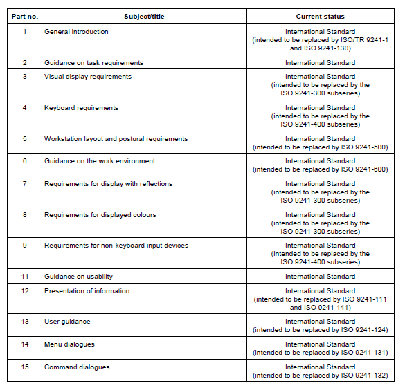
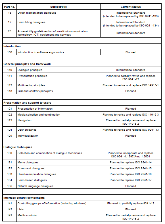
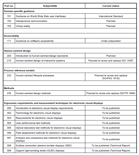
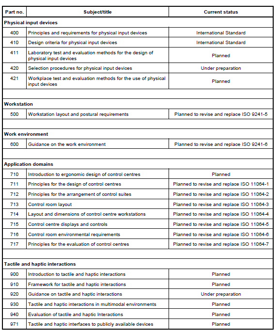
Annex B
(informative)
Sample procedure for assessing applicability and conformance
B.1 General
This annex provides an example of a checklist (see Table B.1) that can be used to determine whether the
applicable recommendations in this part of ISO 9241 have been followed.
The checklist can be used either during product development or for evaluation of a completed product.
The checklist contains all recommendations from this part of ISO 9241, presented in sequence.
It should be noted that the procedure described is itself provided as guidance and is not an exhaustive
process to be used as a substitute for the standard itself.
Use of the checklist provides a basis for
- determining which of the recommendations are applicable,
- determining whether applicable recommendations have been followed, and
- providing a systematic listing of all the applicable recommendations that have been followed.
The majority of the recommendations are applicable to all software Web user interfaces and increase
usability.
However, usability depends upon the context of use (the users, tasks environment and technology). Where
a
conditional "if" appears in a recommendation, it is necessary to determine whether or not the context
of use in
which the software Web user interface is, or is intended to be, used is included within the conditions
covered
by the "if" statement. For each context-dependent recommendation, information on applicable
circumstances
is given in the clause/subclause. If the conditional statement does not apply and thus the
recommendation is
not applicable, this should be noted in the relevant column in the applicability section of Table B.1,
and a brief
explanation should be provided in the "Reason not applicable" column.
The next step involves determining whether the software Web user interface being evaluated conforms to
each recommendation (as applicable). The exact method for making this decision could vary from an
inspection-based judgment of whether a feature is or is not present to testing the software with users.
Whatever the method of evaluation considered most appropriate, the proposed checklist provides space to
give an indication of the level of conformity as well as observations on the method used or the
judgment,
which can be entered in the "Comments" column.
The completed checklist can be used in support of statements relating to conformance of software with
this
part of ISO 9241, providing a list of those applicable recommendations to which conformance applies.
B.2 How to use the checklist
Clause/subclause numbers and titles are presented in the first two columns of Table B.1.
The third column is used to indicate whether the recommendation in each clause/subclause is applicable
or
not. All those that have no conditions attached to them already have a "Y" (for "Yes") inserted in the
third
column to show that they are applicable.
All other clauses need to be checked in relation to the design context of the specific software system
being
developed or assessed. It should be noted that some recommendations for which there is a conditional
statement will need to have column three completed.
In addition, the applicability of all the recommendations should be checked and "Y" or "N" entered in
column
three, as appropriate.
Where a recommendation is not applicable a brief note giving the reasons should be inserted in column
four.
When checking whether a recommendation has been satisfied it will be necessary to review all those
items
which indicated as being applicable in column three.
There should be an entry in the relevant place in column five, six or seven, showing whether each
applicable
recommendation has been satisfied ("Yes"), partially satisfied ("Partially") or not satisfied ("No").
Any
clause/subclause which is either judged to be partially satisfied, or not satisfied should be
accompanied by a
brief note explaining the reasons why this is the case.
Table B.1 - Example checklist
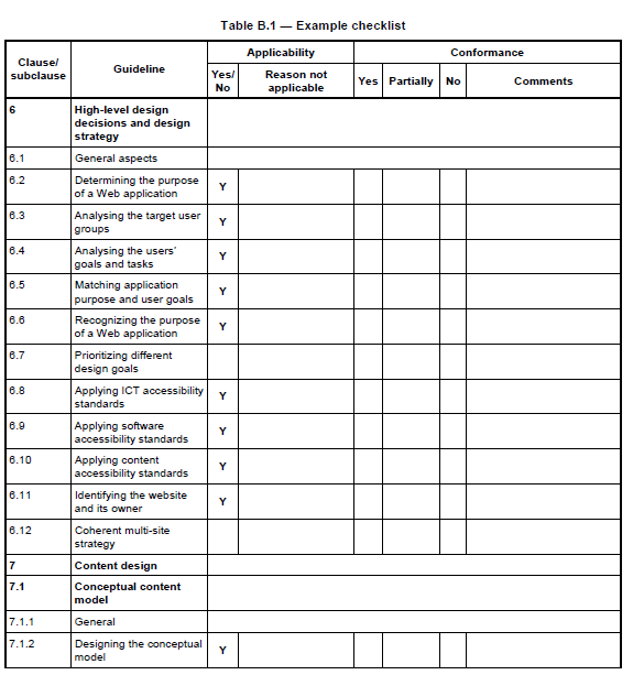
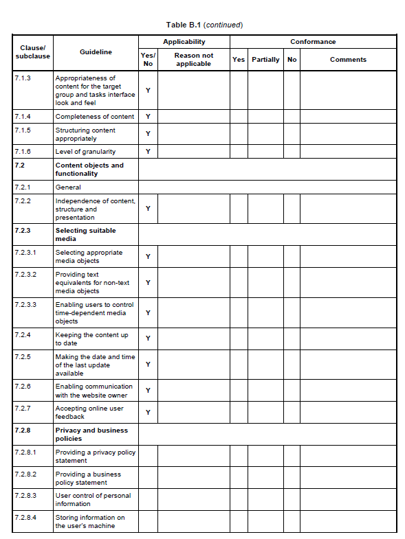
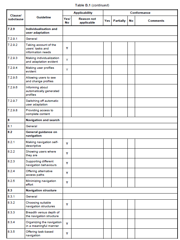
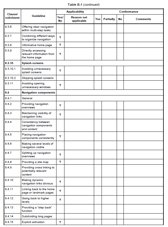
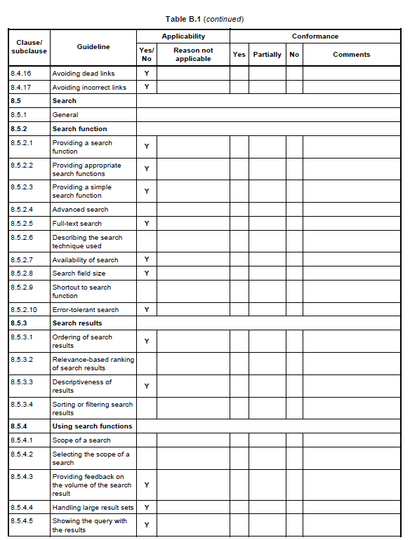
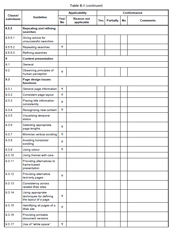
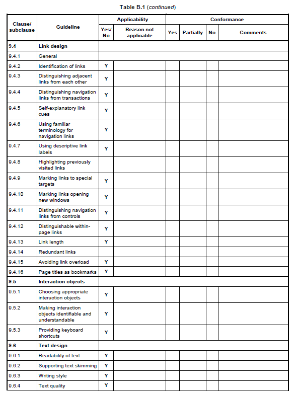
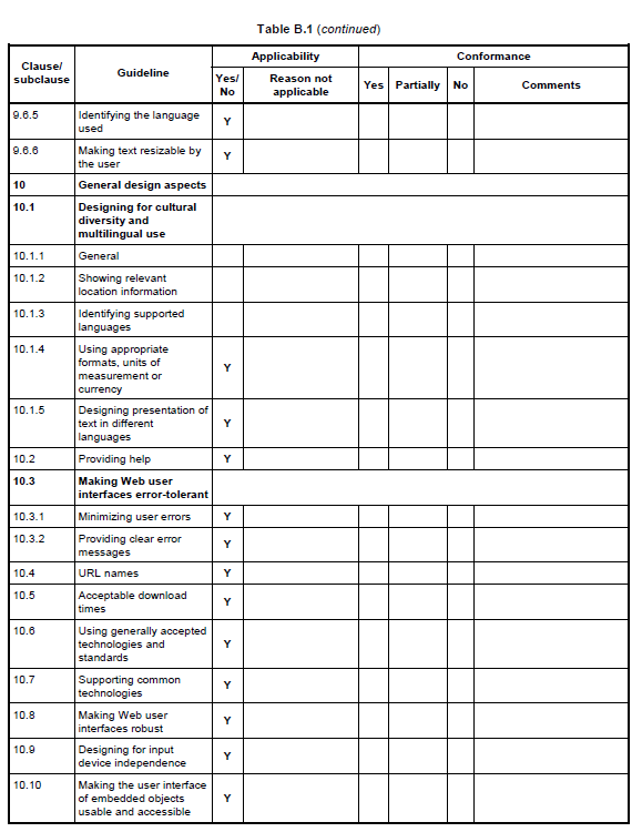
Bibliography
[1] ISO 639 (all parts), Codes for the representation of names of languages
[2] ISO 5127, Information and documentation — Vocabulary
[3] ISO 8601, Data elements and interchange formats — Information interchange — Representation of dates and times
[4] ISO/IEC 13250, Information technology — SGML applications — Topic maps
[5] ISO/TR 16982, Ergonomics of human-system interaction — Usability methods supporting human-centred design
[6] ISO/TR 18529, Ergonomics — Ergonomics of human-system interaction — Human-centred lifecycle process descriptions
[7] BRINCK, T., GERGLE, D. and WOOD, S. D., Usability for the Web: designing websites that work, San Francisco, CA, Morgan Kaufmann Publishers, 2002
[8] KOJANI, S. J. et al., Research-based Web design and Usability Guidelines, U.S. Department of Health and Human Services, 2003 (http://www.usability.gov )
[9] NIELSEN, J., Designing Web usability the practice of simplicity. Indianapolis, New Riders Publishing, 2000
[10] NOGIER, J. F., Ergonomie du logiciel et design Web. Dunod, 2003 (in French)
[11] DUYNEVAN, D. K.; LANDAY, J. A. & HONG, J. I., The Design of Sites - Patterns, Principles andProcesses for Crafting a Customer-Centred Web Experience
, Boston, Addison-Wesley, 2003
[12] SCANO, R., Accessibilita dalla teoria alla realita. Associazione, IWA, Italy, 2004 (in Italian)
[13] STEPHANIDIS, C. (ed.), User Interfaces for All - Concepts, Methods and Tools. Mahwah, NJ. Lawrence, Erlbaum Associates, 2001
[14] TRAVIS, D.S., E-Commerce Usability: Tools and Techniques to Perfect the On-line Experience. London,
Taylor & Francis, 2003
[15] CC/PP, Composite Capability/Preference Profiles: Structure and Vocabularies, World Wide Web
Consortium (W3C) (
http://www.w3.org/TR/2003/WD-CCPP-struct-vocab-20030325/
)
(Working draft, 2003)
[16] P3P1.1, The Platform for Privacy Preferences 1.1, World Wide Web Consortium (W3C) Specification
[17] CSS 2.1, Cascading Style Sheets Level 2, Revision 1, World Wide Web Consortium (W3C)


